The Problem:
Kennedy Valve would regularly attend trade shows throughout the year to showcase their fire protection products. Most of their displays were showing their age, and had been developed without the aid of a graphic designer. As their first in-house graphic designer, I was tasked with creating a new look for these displays that invoked Kennedy Valve's commitment to dependable, technological innovation.
The Process:
I noticed that a lot of the old display material was loaded with information, a lot of which was reiterated in other literature at the booth. Ultimately, these displays existed to draw people towards the booth, so my first few passes were focused primarily on putting our products front and center in a pleasing design, rather than overwhelming passersby with context-specific details.
Normally I would do my thumbnails on paper for projects like this, but since I knew we would be utilizing 3d renders of our products I decided to plop them into Photoshop and begin iterating to get a feel for what the overall composition should be.
The Solution:
The final design was structured around the following three goals:
1. Emphasize the brand.
Keeping it simple with just the logo and brand color keeps what's important front and center. A triangular shape leads the eye down to our central tier.
2. Show off the product.
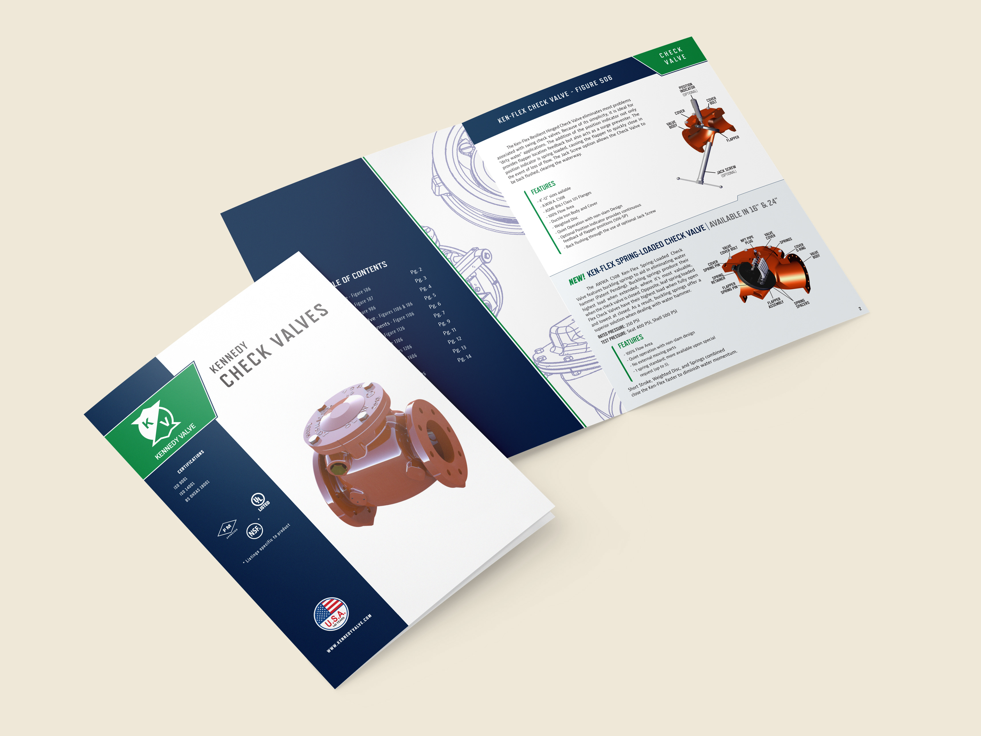
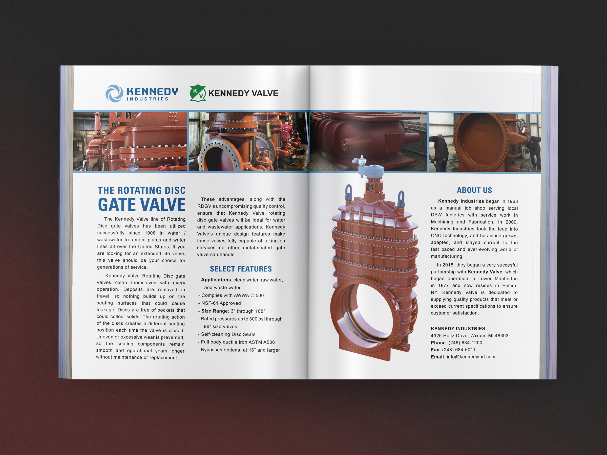
This included both photos and 3D renders, which required some photo editing and color matching to achieve a consistent visual style. With a focus on technology, a glossy, hyper-real look was chosen.
3. Tell them what's underneath.
What better way to convey the company's pride and innovation than to give viewers a brazen peak into the design behind it all? Thoughtful use of product engineering drawings show viewers that innovative design is the foundation holding up all of their products.
The Result:
They ended up liking the design so much it became the basis for the company's mousepad design.


